Don’t like character designs? Vote with your wallet

Whether it be literature or electronic games, they are fiction. Realism is a genre for sure, and yet even in that it is make belief unless it is a documentary piece or similar. As such, any character we may meet within any entertainment media has very little to do with real life. Television, movies, radio and other industries with live people doing performances are of course another thing, but even then the characters these people act are simple fiction. Documentaries and such of course are exceptions.

Let’s cut the chase. Theme for some of the posts in near future is Video game characters are not real people.

When fictional characters are designed, majority of the time they have encompass some level of ideal physique in them. In comics most of our superhero characters are nearly perfect in physique and have almost flawless appearance. Those with rugged appearance on the other hand then to have skills and abilities far exceeding normal people. The same applies to game characters as well, where we have Shepard, Lara Croft and various others sharing the same idea myths of old had.

Some would argue that these ideal appearances give the wrong image of reality. That would apply, if the products would be about reality. If one would come up to me and tell that Duke Nukem is how an ideal man should be, I would laugh at his face. While they are indeed ideal archetypes, nothing actually says that this is how we should be. More often than not, it is almost impossible to be something that is unreal in physical terms when it comes to humans. Cosplay as much as you want, but you will never be a cute little girl wearing skimpy black outfit with gold rims.

Appearances have always been a thorn in certain groups’ eyes. While we are bombarded with people calling women being sexualised in comics because of their perfect physique, often the physique of men is completely pushed aside. Next to this, these characters are not women or men, they are merely presentations of ideas of characters. With fiction you have no reason to stick with reality unless that is your aim and goal. While Grant Morrison is a dividing personality, his quote on how children have the ability to see fiction as it really is hits the spot with this one; adults ask stupid questions. The children I have worked with don’t question how or why something is in cartoons or games they play because they know it’s just la-la land. However, they have always been extremely interested in how the real world functions, the hows and whys of sciences. These discussions are something I always look forwards when working with kids, because this shows how they make that clear cut separation between reality and fiction. Hell, once I drew a princess character as a birthday gift to a girl (she asked for one) and when she presented it to her mother, she commented how the character’s shapes were a bit too curved. The girl commented to this that it was just fairytale and in fairytales that’s OK.

It would be nice if we all could make that distinction as well.

Nevertheless, it must also be argued that certain degree character designs need to respect the overall accepted norms a society has. This of course translates regionally very differently as we have seen throughout the years. In addition to that, character designs more often than not represent the idea of a character or certain groups’ idea of a character, not the rest of the population. Archetypes are a thing of their own and most of the time characters are mostly transformations of these archetypes into the setting. Whether or not they are successful is dependant largely on how well they are realized by the producers and accepted by the consumers.

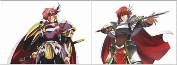
With the 3DS Langrisser we see certain archetypes represented for better or worse in a strong sub-cultural flavour. Langrisser has always been a series with a strong tone for fanservice, that can’t be denied. I’m not sure whether or not it is my own bias taking lead here, but I can’t shake the view that Urushihara’s character designs were less fanservice and more sexier. The two are of course dependant completely on opinion, so we’ll give a look at the updated 3DS Langrisser site.

One of the most revamped sections of the site is Characters, and now we actually have information and official English names for the characters. This is good, because now I can correct what I have been calling them otherwise, Ares being one of them. The two added characters are, without circling around it too much, two female characters that more or less look underdeveloped and underage. A loli archetype, to be straight about the issue.

One on hand the dress has a nice design, but on other hand we can argue whether or not the dress is fitting for this character

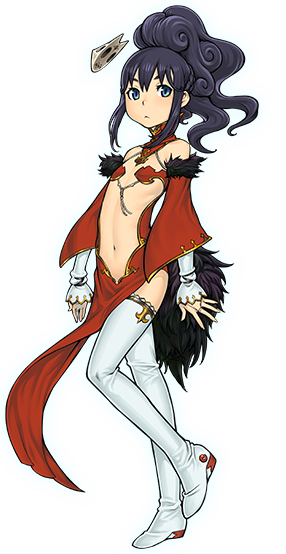
First of the two new ones is Jessica, a character that has appeared in every mainline Langrisser game as the Priestess of Light. As an avatar of the Goddess Lushiris, Jessica has the power to reincarnate herself and thus her soul is old as hell. Her appearance across the games doesn’t change much, a thing that still applies to the 3DS Langrisser. Granted, now she looks like a small girl, but all the elements Jessica has carried before are there, including some elements from past Urushihara designs. While I personally may think this is more or less tasteless design for the bodybuild, within fiction it has its own merits to argue that it exists. On the other hand, there is no dress and there is no Jessica to wear a dress like this. There’s no reason to treat Jessica has a human being. It’s only a cartoon, after all.

I do like the costume. It's simple, has a royal flavour to it and lines are clearly defined. It may be bit too sexy, but you're reading a post from a guy who usually defends porn
I do like the costume. It’s simple, has a royal flavour to it with clear linework. It may be bit too sexy, but you’re reading a post from a guy who usually defends porn

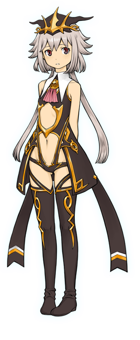
Licorice is a new character on herself, being the sister of Ares rather than Elma. With the whole dark motif she has going on for her, we can wager this has something to do with her kidnapping. Then again her name is Licorice and licorice is often dark but tasty. However, we can argue the same points with her design as it was with Jessica’s design, but then again this isn’t porn or remotely anything similar.

Whether or not either Jessica’s or Licorice’s designs are of good taste or something else is up to you. One on hand it can be argued that both have good design that serve their purposes and represent the ideas well enough, but some would argue that these designs are inappropriate. I would try to choose the golden middle path, arguing that both characters do have good design, but could use some tweaking in order to meet certain global threshold of accepted matters. The last part of that argument is bullshit thou, as there never can be one.

Mankind is not one nation with shared ideals. We barely can share same ideals within the same country, not to mention with our neighbours and friends. Thus, it should be more applicable to say that designs like this are not made to attract everybody. The 3DS Langrisser from its visual standpoint is clearly making a stance to stand separate from the older series, both Langrisser and Langrisser Millennium. The developers are aiming the core gamer market with this game. In Japan this often crosses over with people who have the anime sub-culture as their largest hobby. The same can’t be said of the rest of the world, as anime has never been truly mainstream. There has been mainstream anime, but that’s another thing. Anime doesn’t sell in the West because of that, but also because the visual style largely puts some people off. The sub-culture doesn’t do much favours to positively promote itself either, and there recently there has been an idiotic movement that tried to give certain game a better image by a very limited group of people, but we’ll get back to that soon enough. Langrisser has always been anime, and with the 3DS Langrisser representing the modern accepted image of the characters that the sub-culture in that part of the world accepts, who are we to say anything to it?

Fictional designs, whatever they may be, can be attractive or off putting. They most likely will offend some people while others applaud them for whatever reason. That does not mean that we have any rights to say what should be allowed and would should not, unless laws are broken. If one doesn’t agree with the presented product, this person has all the rights to vote with his wallet. That is true power a customer has. However, they have no rights to say that this won’t do because of one’s own feelings or worldviews. As long as we live in the realms of legality, limiting someone’s freedom to express his ideas in any form is extremely stupid, borderline illegal in some cases. Often than not it’s better to shut up than complain and be on your way to do something more pleasant, a notion I should most likely put into action more often.

Of course, designs change with time and some will argue how things are or were better

The Three Guilty Gear Xrd newcomers

It’s been some time since we discussed Guilty Gear Xrd’s comparative character designs. This is because the rest of the characters they put in are, more or less, the same design. Bedman didn’t warrant his own post, and Ramlethal was out of my radar at the time. With the latest new character addition, Elphelt, it would look like it’s time to make another Guilty Gear Character design post.

The thing we need to remember that the original Guilty Gear is very much mid/late 90’s game in visuals. The visuals in Guilty Gear have always had an edge to them with heavy musical influences, like Sol wielding his sword like Queen held his microphone stand in one of the iconic shows in his life. However, just like any long standing franchise, additions reflect their time. Jam Kuradoberi is a very much early 2000’s design with her modified cheongsam. With Xrd we’ve seen how the 2010’s has affected the game from ground up with the use of 3D models. Of course, the designs also reflect their time, and everything has become more clean, clinic even, as compared to the roughened, sketchy nature of the first two games. XX series already had a motion towards for the cleaner and removed a lot of the charm the garage like feeling GG and GGX had to them.

With modern style, the new character designs need to balance with the preset Guilty Gear visual choices and with the new addition they are to bring in. On one hand we can’t have a generic character with Guilty Gear sensibilities that are rather out there, but we also don’t want characters that are just full blown stupidly unique little snowflakes.

We won’t cover Sin Kiske, because his design hasn’t changed significantly from Guilty Gear 2, so we’re left with the rest of the three.

Bedman

Bedman's most likely a reference to Bedemon, but I'm most likely off with my guess
Bedman’s most likely a reference to Bedemon, but I’m most likely off with my guess

Bedman is… strange. Guilty Gear has had a slew of strange characters before, Zappa being the prime example. I can’t decide whether or not Bedman is too strange, or not strange enough. His design is very Guilty Geari-ish so to speak, but there a lot that don’t make sense, even in Guilty Gear’s terms. One of these elements is the giant screws that protrude from this shoulders. While this explains how he just doesn’t drop from the standing bed, he is also bound from his hands. This is perhaps one of those points that is completely up to the opinion whether or not it works.

Despite Bedman’s somewhat busy appearance, it is surprisingly sparse and lacks certain amount of detail. The bed’s limbs are the main concentration of points of interesting, and the sleeper himself, as well as the platform he is bound to, lack any proper points of interests outside the aforementioned screws. Well, the person does have a pink arrow on his forehead, but that’s not all too interesting. However, what is interesting is the crown the bed’s head wears. What it represents may be that either the person or the bed is considered some sort of king of a dream realm. Most likely the two are one. This is not really supported by anything and I’m just musing myself over the issue.

There are scriptures around Bedman, and in Guilty Gear scriptures have always represented the character and their motif. Sol has Free on his belt, whereas Ky has Hope. Robo-Ky has Ennui. On the bed’s head is etched Dreamlike Reality, which most likely is some sort of music reference I don’t get. The screws that hold the person on the bed real Déjà Vus, which may or may not have some sort of meaning. It just may mean that within the Dreamlike Reality, the person relives something over and over again. The wheels read ONEIROI, which could be translated as one colour. This would reflect the colour scheme Bedman has, where the pink, or washed out royal purple, is the governing colour with only a dash of gold here and there. Black is used to fill in areas with steel gray in order to balance the certain complex simplicity. Speaking of wheels, despite the bed being wheeled in to the fights, it lacks any sort of wheels before the bed takes it fight stance.

Outside these Bedman feels like it’s a character designed to take advantage of the 3D models. In most promotional illustrations Bedman looks towering, a character with an imposing height, but in-game he is rather normal sized. Because the character’s design lacks typical Guilty Gear accessories outside the screws and the arrow on the person’s head, it leaves me rather cold. It lacks the same bold design choices most Guilty Gear designs are known for, and all for its uniqueness Bedman looks something like what could be a good background or a non-playable character rather a straight out newcomer. The concept has solid idea, but the execution leaves something to be desired.

Ramlethal

Condescending petite girls? Now where have I seen this before...
Condescending petite girls? Now where have I seen this before…

Be it Ramlethal or Ramletherl, this Valentine continues to proud mainline Guilty Gear tradition of having a female boss character. Ramlethal’s design mirrors very much a certain type of female character we’ve seen in Japanese media for some time now. She is somewhat a character archetype with a cool and emotionless front, but then just turns bears a row of monster teeth and proceeds to devastate the player. Unlike I-No who was a sadist, Ramlethal seems to enjoy defeat of weaker ones as per rich lady like persona.

Ramlethal’s motif is teeth. She enters the stage from a mouth that her cape forms, with saliva and all, and her familiars carry her two swords with their highly visible rows of teeth. The cape’s teeth are used in a throw as a buzz saw. As with Justice and Dizzy, Ramlethal has a giant beam as one of her Over Drive moves, where we see the two familiars combined into one big blob with teeth. It would seem like that all Valentines and bosses related to them share this Voltekka kind of attack. Ramlethal’s beam Over Drive reminds me of Gradius’ Core for some reason.

All the main series bosses have been rather contained. Even Leopaldon, despite his huge size, didn’t take too much screen estate outside his body. Ramlethal’s design is spread into two main elements, which naturally are her main body and her swords. The swords themselves are nothing special, having elements from traditional katana and Zone of the Ender like aesthetics otherwise. One could almost make a comparison between them and Type-74 PB Blade from Muv-Luv. However, the similarities between the two are purely coincidental. However, overall the amount of space Ramlethal takes is about the same as previous bosses because of her petite body size.

Ramlethal’s body design, however, is where the you get a nice mix of old and new. Ramlethal has nice amount of details here and there. All around her body one can find golden locks holding straps in place. Black locks hold her shoulder amours in place, which adds some colour juxtaposition to her. It should be noted that her normal colour is very much ganguro, with plain white contrasted against her tanned skin. Green is splashed here and there to balance out, and the inside of her cape is naturally flesh shaded as per the whole teeth and mouth thing going on for her. This is similar to Ky’s clothing, where strategically placed blue is contrasted against plain white, but there’s nothing to that outside the interest of note.

Her certain lack of clothing is nothing new in video games, or even Guilty Gear, but it should be noted that it’s not fetishised either. Then again, everything is somebody’s fetish. Combined with the cape, Ramlethal has a nice balance with nigh weightless body and heavy weighted paraphnelia.

The hat she is wearing has same round locks that could be holding the belt straps. The hat itself has similar feeling to the previous Valentine’s hat, but this time it’s somewhat clear that Guilty Gear has a bit more emphasized animal ear element.

I haven’t found any proper screen shots or promotional pictures of what the scriptures around her body say, but her right sword has something like Right Here is * I’m Left. If you can make out what the * says, drop me a message. The left sword seems to have the same scripture, so I’m Left could mean leaving.

Ramlethal is a good design overall. Guilty Gear has seen a healthy number of female contestants through the years, and her design stands out from the crowd just as much as the rest. It’s not intentionally over-strange like Dizzy’s and manages to balance between bringing in something new and sticking to the preset aesthetics. There are numerous nice little details, like her cape being a gaping jaw and does impossible things for a clothing, that keep her interesting and wholesome design.

Elphelt

A bride rabbit , I guess?

Even a music illiterate like me recognizes the Guns & Roses motif going on here. And the animal ears. And the wedding gown. Elphelt is the latest addition to the roster, and like Ramlethal, Elphelt’s main colour is white. Perhaps subduing the plain white with a hint of red to make it more rosé in colour could’ve been a better option, as now you’ve got around six or seven characters with white as main coloured, accented with something else. Well, alternate colours exist for a reason.

Elphelt ‘s rose motif carries over to her main body, not just to the bunch of three on her hip. Her skirt has spikes around the lower rim, the belt straps’ ends have rings with three spikes, her wrists have three spikes protruding outwards from her body and even her head has three spikes. Three could be one of her motifs, but that doesn’t seem to be the case. There are five pink four-leaf clovers on her body. There’s only one spike on her shoulders, has one bow tie under them. There’s two metal straps on her upper arms as well for no other reason than Guilty Gear accessories. It could’ve been an interesting thing to do with the character to have three of everything and it wouldn’t have been hard to accomplish. Outside having a consistent numbering motif, there wouldn’t been anything more that.

Incidentally, she has three guns. Huh.

It should be noted that Elphelt has two points where your eyes may be drawn to; her eyes and her bosom. Elphelt’s eyes are icy blue and strand out strikingly well from otherwise reddish colours scheme, and combined with her larger breasts create a certain kind zone that stands apart from the rest of the body. The skin coloured area is nicely broken down with a pink strap and a green clover, which is also repeated in one of her guns. Naturally, the eyes and overall shape of her dress, open bosom and all, represent femininity to a large extent. She also wears overknee socks with straps going up her main body, further solidifying her feminity. Also, her rifle is pink and a pink bow on it. Her shotgun, while pink too, has a red rose and a green clover on it. Her handgun has a pink cover with an underside of dark metal gray, but with golden wings attached to above the grip. Elphelt also carries a pink sword with a bow tied to it, and seem to use it in her Instant Kill, where she places the opponent atop a wedding cake and proceeds to cut in half.

I’m getting a bit mixed messages here.

And oh, she has a broom she flies on. Or is that her flower bukee?

031

The front of her skirt has some sort of scripture there, but no shot, promotional not, shows what it says. What interest in her the most is that she seems to be a departure from the melee weapons used in Guilty Gear. I won’t go into her gameplay at all, as I would need to play as her first to say anything.

Elphelt’s design is rather generic, but it works to the needed extent because of the added Guilty Gear flavour. There is less strangeness to her as much as there is a grandeur. Even from her design we can deduce that she is a sort of klutz. That is what good design conveys; elements what the character is like without giving any proper hints. That also may say that the character archetype is overused at this point, but I’m giving her the benefit of doubt this time. There’s a chance that she will see quite a lot of doujin made out of her.

Elphelt is a character that couldn’t have been made for any of the previous games. Her very clean cut look sits very well in this time. Bedman could’ve been made at any point of the franchise, Ramlethal to lesser degree, but both of them would’ve seen much more sketchier appearances with either 90’s or 00’s thrown in. Even during 00’s Elphelt could’ve become a gun wielding nun with nunchucks rather than what she is now. Because of Xrd new take on the franchise, mixing old with the new, Elphelt managed to be what she is now. Her design wouldn’t work in BlazBlue either because of the aesthetics in that series.

It would be interesting to see more character getting major overhauls with these new characters. However, it would seem like ArcSys got cold feet from the divided fan reaction over the previous changes, or hasn’t got any time to redesign most of the veterans. Xrd is still a good place to make changes to the visuals as long as they are kept true to the core, and the tree newcomers show that the visual direction of Xrd is still true. I hope they will keep it that way in the future.