Monomania isn’t good for your health, or how source hunting kept me awake during night shift

Palworld is stirring some old sandbox arguments again, with kids going on about how their favourite monster battling and raising series is better than the other. Some find monsters in their pockets better, some would rather venture on the File Island. Then again, some like making monsters out of music CD data, so everyone has their own kinks. However, a strange argument about Digimon predating Pokémon pops up surprisingly often, but when asked no source is provided.

To look at the history of things, let’s start with Pokémon. If Bulbapedia and Helix Chamber are anything to go by as sources, Game Freak pitched Capsule Monsters at Nintendo in 1990. The main source of inspiration has been Satoshi Tajiri’s own childhood, with bug collecting and Ultraseven’s Capsule Monsters probably being the main points. Helix Chamber’s research on how Pokémon’s attacks were developed seem to indicate that the game was first inspired by how team member monsters battled in the first SaGa game. Somewhere down the like more elements were introduced and how attacks worked went under renovation, something the game did multiple times before it was split into Red and Green versions and released on 27th of February 1996.

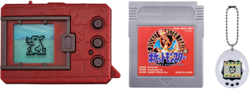
I admit, I’m not versed on the developmental history of Tamagotchi. Aki Maita and Akihiro Yokoi are the two people coined to have developed the concept for Bandai. However, Yokoi seems to be the originator of the concept, as he was the founder of WiZ, a company that handled toy development and planning. According to a 1997 New York Times article, he was inspired by an ad where a kid couldn’t bring his pet turtle on a vacation. Hence, a virtual pet. The original proposal for Tamagotchi seems to have been made in 1995, which was about a mobile pet in the form of a wrist watch rather than a keychain creature raising simulator.

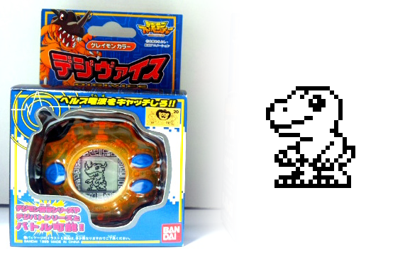
Aki Maita worked at Bandai and helped to solidify Tamagotchi’s concepts into its final form. At its release in 23rd of November 1996, Maita was cited as the creator of Tamagotchi for PR reasons, though Yokoi as the brains behind the original pitch was publicized with the release of the first Digital Monster V-Pet in 26th of June 1997.

The names associated with Digital Monster are Makoto Kitagawa and Kenji Watanabe. While the two WiZ employees were working on the spec documents for the second generation of Tamagotchi, they had discussed about the concept for a raising simulator for boys. WiZ would then pitch Digimon to Bandai in 1996.

All this can be skimmed for various wikis and such, but as we know, anyone can edit wikis and hey don’t necessarily have factual info. As it was with Digital Monster article, which had it stating that the Digimon franchise started in 1993, despite even the cited source putting it into 1997. This was very recently changed, so somebody noticed and changed it. You can still see the typo being mentioned in the History page. So, at some point someone had put 1993 instead of 1997 into the article, which probably was the source of many people citing Digimon as the older franchise.

If you’re taking anything out of this post, let it be never to trust Wikipedia. Hell, the original typo for 1993 seems be based on a citation for a PlayStation Life article, that is citing Gematsu’s article that was linking to the original source; Premium Bandai webstore page for the 20th anniversary release of the original V-pet. These things trigger my monomania, making me want to find something else I can put more trust on.

So, let’s disregard all those wikis and my tangents. We can find the original release date for Pocket Red and Green at the official Japanese site for the series, which supports the 1996.27.2 date. It was Tuesday.

TBS News’ story from 2021, dates the original Tamagotchi release to 1996.11.23. I’ll have to use this as a supplementary, as Bandai’s official history page for Tamagotchi doesn’t mention the day. Their history page for Digimon does have the original release date of 1997.06.26.

Now that we’ve stablished the original Japanese release dates, going back to the original argument what came first is now solved with one reason why some people might’ve been citing Digimon as a 1993 release. There are few more reasons I can think why people could make this mistake, but the dates discussed here are the original Japanese releases.

For the North American market, both Tamagotchi and Digital Monster both arrived before Pokémon. Bandai’s 1998 press release cites Tamagotchi’s US release date to be December 1st, 1997 and states the nationwide release of DigiMon happening on 10th of February 1998. Toys R Us got to pre-sell them in December 5th 1997. The press release is adamant on calling both the first virtual pet and virtual monster, which seems a pre-emptive tactic against Pokémon’s future arrival.

Pokémon Red and Blue wouldn’t hit the NA market until September 28th, 1998. We can nab the European release date for Red and Blue from the Nintendo 3DS Virtual Console store page, with the date being May 10th, 1999.

Trying to pin down the original release dates for the European version of Tamagotchi and Digital Monster is a bit more challenging, as Bandai or fans don’t seem to care about the Old World. However, based on news articles I’ve seen tonight, Tamagotchi hit European markets in 1997 and DigiMon followed after it in 1998. Nintendo didn’t handle the European markets all that well in the 1980s and 1990s, so Bandai could easily take advantage of the three-year period it took for the original Pokémon to arrive. I distinctly remember reading a newspaper article about the monster collecting wars from a tabloid, which stated that Bandai had more years under its belt as the maker of monster raising simulators. Might be a false memory though.

So, inferring from this I’ll say that some people are correct that Tamagotchi and Digital Monster are older than Pokémon in terms of release dates in North America and Europe. Kids don’t really go to look for original Japanese release years of their games and toys, and most adults don’t give a shit. If you never go look into the history of things, it’s understandable that personal recollection might conflict with factuality. Naturally this would also lead YouTubers and podcaster people using their personal recollections rather than double-checking facts, which perpetuate the misunderstanding.

An element that pops up with the bitching which one came first almost always comes with some arguments about Digimon being a ripoff of Pokémon or vice versa. Some people throw Tamagotchi in there as a catch-all to predate it further, but as we’ve seen from the dates, all three are a bit too close to be directly inspired by the competitor/ sister series.

Pokémon’s six-years long development cycle didn’t coincide with Digimon in no manner, and Tamagotchi was pitched at Bandai the same year Pocket Monsters was revealed to the public in Japan, with the trademark filing date being September 11th, 1995. Pokémon would have a later filing date of August 9th, 1996. You can find these on J-Plat Pat with Registration numbers 4245696 and 4097791 respectively. All this is to illustrate that neither Tamagotchi nor Digimon had any effect on how the original Pokémon games were forming up. However, I can’t say the same about Digital Monster taking a thing from Pokémon, but entertaining these ifs is iffy at best, and a useless exercise at worst. However, the scopes between the three were completely different in 1997. Pokémon offered an extensive world and 150 monsters to collect and train while both Tamagotchi and Digital Monster had a smaller scale experience with emphasize on pet care. Frankly, Bandai’s virtual pets were steamrolled by the Pocket Monsters in the end.

However, I am going to entertain the idea that Bandai wanted their product on the world stage first and took advantage of the longer localization process Pokémon demanded.

I haven’t appeased my original source of my momentary monomania though. I haven’t found articles that maintain Digimon as the older franchise. Maybe all it took was that one Wikipedia article’s typo to mislead people. Though I’m sure if I looked harder into old newspaper articles I’d find a bunch of them. However, as I mentioned, I’ve read these articles myself, but that might be something I’m misremembering. I did find one market salesmen mentioning how Tamagotchi was a passed fad with the arrival of Pokémon from a 2000 news article, but that’s not scratching the itch.

Though it’s funny how I can find a lot of new articles in one newspaper about Tamagotchi being a useless toy, and then selling out nationwide in the same month from 1997, only to be followed by a news article a couple of months later Marion Caspers-Merk from Germany stating how Tamagotchi was becoming a little devil and an environmental danger. Unsurprisingly, the first news regarding Pokémon is about the shock episode Electric Soldier Porygon caused. One of the best ways to describe Digital Monster I saw about digital Darwinism. Pokémon, at least as a game, seems to have made Bandai’s two raising sims obsolete as they landed in the Western shores. Market realities rarely care which series we find personally preferable.

I may not have satisfied myself about finding any source that would’ve claimed Digimon predating Pokémon. It feels anti-climatic if all it takes is one typo. At least I learned that Japanese costumed hero live-action shows had a genre name in the US in the wake of Power Rangers circa 1994; cyber-socky.

GDP – Gabumon Design Progression

Sorry, no Aalt today, A9 to the rescue. You guessed it, time for another Digimon design post.

1 Gabumon Digivice

What a cute little bugger. Like all early Digimon, Gabumon had its sprite designed first. The actual drawing and finalised design only comes later. As usual, the first sprite comes from the Pendulum toys with its small displays. As we don’t have the official design yet, this is the most basic image that exists, and it looks like a weird bunny that’s standing up, ready for a fight.

2 Gabumon

And there we go, the actual design. Naturally, the first thing that springs out here is the pelt, a new addition compared to the sprite. Other features have been exaggerated: a longer snout, large teeth, bigger horn, thicker legs and bigger ears. The sprite already featured stripes of some sort, but now they are transferred unto the fur and boy howdy have they multiplied. Giant claws extend from the fur, with two extra (empty) arms hanging in the back. Another new addition is the tail, which seems quite reptilian (which Gabumon is, underneath this fur). Finally, there is the egg shaped mark on its belly. Personally, I see some small resemblances to Agumon here as well, the yellow colour of the main body, the small feet and the somewhat protruding snout with higher placed eyes.

3 Gabumon_ver_s

Games time: Digimon Ver. S. Although our friend got squashed a bit, most details remain, although the fur colour got quite a bit darker. Most of the stripes on the fur stay in approximately the same place though, which surprised me of a sprite of this size. Furthermore, the toe claws are a bit sharper instead of the dull ones from above. The only other major change is the belly, only because there was no enough room to properly put that whole design in such a limited space.

If there is a chance to talk about the V-Tamer manga, I’ll take it. It’s one of my favourite pieces of Digimon media, but that’s something for another time. This is not quite the Gabumon you know, yet he appeared a few months later than the sprite above.

Disregarding the ladle and pan as props, it’s a more simple design with a cute charm. While Gabumon still wears his fur, it has a more smoother look. This manga isn’t really clear on his extra arms though, as they can sometimes be seen (as in the picture above, below his left arm) but on other drawings they are completely missing. The overall shape of a lot more simplified, with the snout being much more flat and wide (yet retaining his teeth). The very small tuft of hair that was present in the original design has grown quite a bit, even surrounding his horn. The belly markings are still there, but have seen a bit of a redesign giving the top marking extra curves while giving the lower ones pointy edges. To top it off, its feet have also shrunk considerably so the for actually drags over the ground a little.

Very noticeable is the fact that its claws turn into digits, allowing it to grab things. Previous incarnations actually have hands hidden inside the fur, making the claws part of the ‘wearable’ fur.

6 DMW

As can be seen here, in a screenshot from Digimon World. A very faithful model, with only the smallest details left out or simplified such as the bumps on its tail, no small tuft of hair around the horn and the lack of extra arms, the rest is fully visible. The aforementioned hands within the fur, the belly design, the horn and the long ears. Its teeth are even protruding giving it a bit of a savage look.

7 Gabumon Anime

Time for Adventure. This design is a whole lot more rounder and cuddlier, with the savage details being toned down for a cuter look. Let’s start from the top, the horn. It is almost completely identical, save for a few missing lines on the top and bottom and the colour. The original horn had a lighter shade of yellow than the main body, but those are minor things. The fur has gotten a bit lighter and the purple stripes have turned dark blue. Most of the markings are in their original place, but some are missing like on his ears and his extra arms. Now for the most major change, the face. Just like in the manga it is shorter and wider, giving it a cuter look. This is also made possible by making the teeth smaller and making them stick out less. Because of these changes, this reptile head looks more like a weird dog.

The eyes have changed ever so slightly, with a little less eyewhite being visible. This also contributes to the cute factor, has it is less of a predatory look. The mouth is changed in a very subtle way, by giving Gabumon a chin of sorts clearly defining the head by adding an extra line above the markings on its belly. This gives off the idea of it having a very fat neck.

Yet again we have to look at its belly markings, because they have changed again. Just like the rest of the design, they got smoother and lighter, but more importantly it got symmetrical. You can argue that the original design has no clear perspective for the belly markings, but it’s also possible it’s just a very weird shape in general. The arms lack a few veins as is common with the early designs, but they’re also slightly longer and more importantly closer to the actual claw part of the fur. Ending at its feet, we have smaller toes (claws) that are more removed from each other while also being sharper.

9 Gabumon_dgp

Honestly, we cannot tell all that much from this image. I just really wanted to include it, since he looks baller as fuck.

11 Gabumonx

X-Antibody time. As always, these designs are complete overhauls being based more on nature and ‘realism’ as far as that’s possible. In the case of Gabumon, that means that it’s no longer a reptile, but a beast, drawing more inspiration of a giant ferret. Its horn size (heh) increased and the fur changed to a darker shade of blue / purple. It covers almost the same area, except for the snout and one of its arms with a different pattern. This also reveals the way smaller teeth and a snout that’s not on the fur. Claws have formed at the end of his hands, and the claw on the fur has drastically increased in size. According to the lore, it picks up pieces of fur left behind by Garurumon and shapes it into his fur pelt. He keeps one arm bare to set it on fire to punch others with (we can only hope it’s magical fire). It’s unclear if this form has two extra sets of arms as well, as images are scarce of Gabumon-X. The tail has changed from a reptilian tail to a furry one and the other big change his the belly markings. The belly itself is a dark purple instead of teal, and the markings itself have a drastic different form with very sharp corners. As far as I know, the markings have no meaning but it’s still interesting how they even changed that aspect.

13 Gabumon_redigi

We also got a slight redesign in Re:Digitise. This one is fully based on the original design and doesn’t have too many differences except for some minor ones. The horn is sharper at the end, and the markings are more subtle and thin. The fur is almost the same, except that it looks raggedy and worn. The darker stripes are also a little lighter while being in the same places as before. An extra detail is revealed at the mouth however: since the mouth is open, we can actually see the teeth of Gabumon itself and not the fur. The reptilian side comes more way strongly here and is a nice touch. The muscular legs are more defined, and end it sharper claws. All in all, this is personally one if my favourite designs, even is it starts to look a bit like Agumon with a cloth over its head. In all essence, this is not as much as a redesign, but more of an update.


Two more 3D models, from Digimon Masters Online and Digimon Allstar Battle Arena. Both are based on the anime version of Gabumon, but they both show one important change: there are straps beneath the fur to hold unto. It actually makes sense, how else would Gabumon use the claws without them flying off his hands? Nevertheless, it’s seen after. The only other major difference is from the first 3D model, where the belly marking has gotten significantly smaller.


Gabumon from Cyber Sleuth and Cyber Sleuth Hacker Memory. These games share the same artstyle, hence them being grouped together. As you can see, no straps to hold unto, but there is another change: big hands. The size of the hands has increased, causing them to not be fully enveloped by the fur and ‘pop out’ a little. The fur got some extra detail as well, causing it to look a little bit more rugged. To top it all off, and this is a pretty strange choice, the eye colour starts to turn a little brown.

Even though they are basically from the same game, there is one other change between them, although I suspect it’s mostly artstyle related: the first one has a very clear defined tongue while the other goes with a more ‘the inside of the mouth is just red’ approach. Maybe a little mundane to focus on, but at least I mentioned it.

17 Gabumon_tri

Yet again we wrap up with Digimon Tri, and yet again the fur looks a little bit more shabby. Moreover, the colours have turned a little bit less saturated. The tuft of hair as increased at the base of the horn (it hit puberty) and the eyelashes are way more defined. Funnily the eyes itself have turned a little bit more red again, but not as red as the original.

With that we come at the end of some of Gabumons designs, but we have our first bonus feature here: peltless Gabumon!


Only a few images of peltless Gabumon exist, and they vary in colour. This is the true reptilian form: no teeth shown, droopy ears, no beast-snout. You can see the scales on its tail moving along its spine, but the most interesting detail are the markings on its arm. It almost feels out of place, as it looks to me like a military rank tattooed on its arm. But hey, I won’t judge.

Greymon Design Development

Welcome back to guest-post hour, I’m your host, the digi-destined A9. Since we left off at Agumon, it makes sense to go to his most commonly known evolution: Greymon. So let’s not waste any time.

Greymon Prototype

Wait a minute”, I might hear you say. “That’s not Greymon! That’s Rhydon, or Nidoking!” And it’s true, all of those have a very similar shape. But consider this: it’s a rough dinosaur sketch, that’s all that was needed at the time since Greymon wasn’t exactly a poster boy for the Digimon Pendulum series. That spotlight went to Tyrannomon, the true and honest evolution of Agumon. Still, the most prominent features are there: fat belly, three horns and a tail. The only thing that’s missing is the skull that the other versions are wearing over their heads, so let’s take a look at those, shall we?

Continue reading “Greymon Design Development”

ADD – Agumon Design Development

Hello again, guest post writer A9 here again, bringing you more Digimon goodness. This is a followup on my previous post, Digimon Design Evolution, but it’s not required reading or anything. It’s a free country, man!

In an ever-changing franchise, a design is never final. No matter how iconic a character may be, it will change over the years for better or worse. Pikachu got slim, Batman tried on different suits and the Teenage Mutant Ninja Turtles got fucked up.

But this post is, as the title suggests, about Agumon. I already touched a bit upon his changing designs in my previous guest post on here, but now it´s time to take a more in-depth view of this yellow dinosaur over the years. In this post I’ll mainly look at video games, the anime series and the various movies with an other source now and then wedged in. Please note I won’t review the games and such, just the designs.

Agumon Prototype
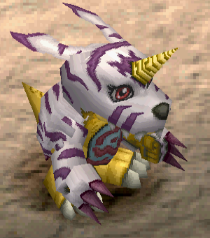
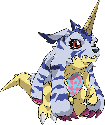
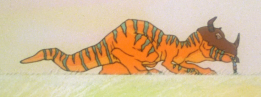
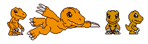
During the production of the Digital Monster toy, sprites were drawn first, followed up with drawn artwork. Only the most basic shapes are recognisable, and they’re so-so as well. The sprite has a big head, but with what looks like a beak. It has quite small arms as well, and no tail can be seen. With the first prototype drawing his head and feet are already fairly similar to his final design, but he’s not as menacing. A friendly upright standing crocodile that lost its tail.

His official design enlarged the arms by adding forearms with large claws for hands (just like his feet in the prototype), giving the feet a little more bulk and giving the head the detail it deserves for it to become a dinosaur-like creature. The nose is raised a little above the rest of his jaw and the head itself is more thick. The eyes clearly have sockets, and has more room at the brow for that dinosaur look. Additionally he got very small ear holes which is always kind of amusing to me even though is makes perfect sense. Such a logical addition, but easily forgotten as most other Digimon don’t have clear defined ears. To finish the design off, add a very small tail (or more like a stub) and send the lad to the gym for some weight training. Huzzah, we got our official Bandai art version of Agumon.

This official art will keep in use over the years (especially merchandise such as the trading card game), but different artists create different Agumon. Imagine, that when his final design was being developed another artist had a crack at it? That’s what probably happened when the publisher of Weekly Shōnen Jump (Shueisha) made a small manga to teach kids how to take care of their Digital Monsters.

Agumon 1997 Manga

Forget dinosaur, welcome dragon. Way bigger, cuter eyes along with a more round face. Thanks to the shape of his head Agumon can still be recognized, but his body is totally different. His chest is white and his arms are miniature sized and on top of that he’s left with a three-fingered claw as hand. This Agumon also went to the gym however, but really seemed to like leg day, almost having rabbit-like features if it weren’t for the actual tail. All in all, I’d say this was a way more conventional design for dragon-like creatures instead of the western comic based one we got.

It was time for a new medium, however. So when the Digital Monster Ver. S got released on the Sega Saturn in 1998, they reused the pixel art from the tamagotchi release, but made a new drawing of Agumon to put on the cover.

This Agumon completely forgot to go to the Gym and looks way more like the prototype. No muscle, no veins, a cute smile and a round body. Perhaps even the only cute thing on the cover at all, as the rest of his fellow Digimon look a lot more like their final designs.

PS1 Digimon World

Welcome to the Playstation 1 era, welcome to Digimon World. This game brought the pet raising and the battles to the third dimension so here we have our first 3D model. The standard pose is relatively the same as the Bandai artwork, but there are some differences. First of, the most glaring one in my opinion, is his colour: a weird shade of yellow has taken over. The reason for this is unknown, it could either be hardware limitations or a design choice (as there have been other yellow Agumon. However, I’m inclined to think it’s hardware limitations since the Playstation uses 24-bit true color to render its colours, and that palette lacks a good shade of orange. Going with yellow is not a bad compromise in that case.

The other glaring difference is the slope of his nose towards the head. Before it was just a minor thing, but here it’s overdone in such a way that the whole skull looks different. He lost his thumb as well, and we won’t be seeing that again. Part of me feels they did away with it for simplicities sake, but one cannot be sure in these things. The earholes and teeth are also not visible anymore, also most likely due to hardware limitations. He is still a little jacked though and his arms are still buff.

Just a few months after his debut on the Playstation, Agumon appeared on TV in the movie Digimon Adventure and a day later in the series also called Digimon Adventure. Even though they were aired a day after each other they actually differ a bit because of the story and tone. As the movie was set mostly during the night and had to fill the role of introducing kids to the franchise on TV it was a bit more darker and mysterious. This was a dinosaur, no talking, just destructive fireballs. Very noticeable is his size though, as he’s almost twice the size of his series counterpart. If we compare this to his Bandai design, we can see he lost most of his muscle again and in exchange lost a little neck fat and received a toothy smile (in the series, at least).

TV Digivice

The anime was a big hit, and that means merchandise. A ‘real’ Digivice was released in which you had multiple Digimon to choose from to fight other Digimon. This toy had more screen space than the original Digital Monsters and along with the success of the anime came an updated pixel art design of Agumon. And really, what is there to say? They absolutely nailed the head, but in my opinion the arms are a bit weak. I don’t want to hammer in the gym references, but he wasn’t feeling it.

WC - Digital Monsters Ver Wonderswan

Enter the WonderSwan, Bandai’s own portable gaming device. Sadly never released in the west, because it’s filled with Digimon games. Digital Monsters Ver. WonderSwan was the pet raising experience ported to the WonderSwan with enhanced graphics. Clearly based off the Bandai art it’s nearly a replica with some very minor differences. Firstly, and I really need to address this: the eye. He’s either high as fuck, or he has seen some bad shit. Secondly his face seems to be a little less long. This could certainly be explained by the perspective, but it still feels a little different regardless. The last change are his veins yet again. His health is improving.

PS1 Digimon Card Battle

When I first laid eyes upon this monstrosity from Digimon World: Digital Card Battle, I felt severe disgust. Mostly because of the veins. Changing your medium really changes the look of things, since that’s all that has really happened, it’s almost precisely the Bandai design, except for the fact that he’s standing up a little more straight. Oh god, the veins.

WC - Digimon Anode - 2

Oh my God, what’s wrong with your face? In Digimon Adventure: Anode Tamer Agumon appears again, but I have to say that the art style in this game is a bit inconsistent. For some reason, his face is about twice the size that it should be in his introductory scene. This game is set in the same world as Digimon Adventure, so it’s no wonder the art style is the same. Besides that huge head.

Even after branching off into other media, the Tamagotchi line was not given up on. Why would they, since they were still successful? Meet Pendulum ZERO Virus Busters.

P Pendulum ZERO

An honest to goodness redesign of the Agumon sprite. Bigger and longer head plus longer arms. A very straightforward update and a lot more recognisable.

WC - Digimon Medley

Another WonderSwan game, Digimon Medley. I felt like this one was notable for featuring one very anime-like design (albeit very, very orange) and one squashed design. Most likely one is used for cutscenes and whatnot, while the other is used for gameplay. It’s still an odd choice however, since the head is actually taller than the full sized one on the left, but a little less wide. His arms and legs are both shorter, and his tail is also a little longer since it´s pointing upwards instead of to the side. In the end, most of these are probably due to gameplay mechanics and system limitations, but it´s still interesting to see.

Hello again, Playsation. Here we have a game with both 2D and 3D Agumon along with a cover appearance. The only reason I mention the cover is because for some reason Agumon’s eye is brown instead of green. Absolutely unbelievable. The 3D model is looking pretty good for the PS1 (if very yellow again and without veins), but the real highlight it the 2D sprite. So small and adorable (and in the right colours as well). Just comparing that to Digimon Medley, what a difference. And to think Digimon World 3 only got released one year later. I know it’s on different hardware and probably made by a different team. But still.

Agumon X

And now we arrive at the fabled X-Antibody Agumon. All X-Antibody Digimon are essentially redesigns with some sort of focus in mind. For our orange friend, it was the dinosaur route, not completely unlike the odd 1997 manga design. He has gotten elements of the Greymon line already: Bigger claws on hand and feet, still no thumbs, a tail and the blue stripes across his body. It also has more than 4 teeth, which should make eating easier.

The similarity with the manga are pretty interesting, as it too has three ‘fingers’, a longer tail and a different coloured chest. I can’t help but wonder if they took a look at that design when working on Agumon X.

Digimon World 4 (or Digimon World X in Japan), released on the PlayStation 2 is certainly an odd one. I have no idea if the weapons make sense in the game in some manner, but I used to see this game on the shelves and it left me very confused.

The left image is from the Japanese game cover having a shorter head than usual and quite big eyes. In contrast with that is the western Agumon (also on the cover) with a longer head. What is it with this weird contrast? Also, big surprise, the ingame model is yellow again. At this point you cannot blame hardware limitations anymore so I’m having trouble determining why they’d stick with yellow at this point. Well, that and why in hell they made this a weird action game with weapons?

Agumon 2006

Happy new year, this is 2006. The year this haunting image was created. I’ll be honest, I hate everything about the redesign. He face got wider and more flat, moving the nose downwards and redesigning them like a power socket. His body is way more round and gone are the muscles, as he got some noodle arms and legs instead. The feet look like balls of clay with some sharp Tic-tacs (the breath mints) shoved in. The whole hand design is gone, and got replaced by a three-pronged claw with some red leather bands strapped around them. Finally, yet again, he’s yellow. According to the lore, this Agumon is still growing and thus weaker than the normal Agumon.

The final detail that I noticed are his teeth. In his previous designs, even with his mouth open you could only see a couple. When his mouth is closed, the traditional design usually shows four teeth sticking out of his mouth. This time, we got a mouthful, just like the Agumon X design.

DS - Digimon World DS agumon

Now that’s a vast improvement since last time. From Digimon World DS, here is Agumon yet again. In these games, Agumon can digivolve into either Greymon or Geogreymon and there is no distinction between the ‘normal’ Agumon and the redesign. Maybe that’s why this sprite is kind of a blend as well. He got some muscle shapes back, longer feed and the nose isn’t a power socket anymore. One thing that does become apparent with this sprite is his longer tail which has been all over the place by now.

Now it´s time for some 3D models from over the years. The Agumon most to the left is from the Japan only PSP title Digimon Adventure (yes, a very original name) which follows the story of, you guessed it, Digimon Adventure. It raises the question why he has the power socket nose and the multiple teeth however. Another mix of the designs? Does Bandai even know anymore?

The following two models are from the PC MMO Digimon Masters Online, which does feature two Agumon designs. The 2006 design looks a lot more like its original design with its noodle arms and smaller feet, but surprisingly it does not have the larger amount of teeth like it should have. To finish it off it’s even a little bit more orange than the original one.

The last render (excuse the seam) is from a multitude of games by now, from the PlayStation 4 titles such as Cyber Sleuth till the mobile game Digimon Links. By far most resembling the original anime design and throwing everything about 2006 out of the window, except for the somewhat weak upper arm.

We´re done with the game models! ..so let´s look at the game covers. Ha ha, I tricked you.

PSV - Next Order

Digimon World Next Order features a fairly normal Agumon, except for his teeth. I swear I didn’t expect to spend so much time about Agumon’s teeth, but he got one extra tooth on each side, and they got bigger. Why, we will never know.

Digimon World Re:Digitize Decode features an Agumon that almost looks like a plushy toy in contrast to Veemon. All of his features are vastly deformed± a smaller, shorter head with a smile, bigger and mostly wider hand and feet but with way shorter claws. I´m not sure which one is cuter, this one or the overworld sprite of Digimon World 3. I´ll let you be the judge of that. All I know his in game mugshot is not a contender. Did he get jacked up too much? Did he inject his forearms? Is this the sloth version? Is this an Agumon with a disability?

Agumon Tri 2

Let’s wrap this thing up with some nostalgia pandering in a very nice way. As a continuation on Digimon Adventure (and Digimon Adventure 02) comes Digimon Tri with a much older original cast and new art style, and that includes the Digimon. Agumon is a bit slimmer, and has a more pointy tail to compliment this. His neck did get a tad longer to keep the size of the head consistent and not turn him into a midget, but that begs the question why he doesn’t just start leg day. Hit the gym, bro! Overall, this design reminds me a lot more of the Adventure movie, albeit much, much smaller.

If only he’d hit the gym.

Digimon Design Evolution

What’s this? No Aaltomies? No! A guest post by some random internet dweeb. The name is A9 and I sometimes work behind the shadows to read some posts over from Aaltomies before they are published. A while ago he asked me to write my own thing, and after postponing it for a long time (sorry Aalt!) I finally wrote this down. I have probably forgotten a few elements, so please bear with me.

So, how did the design of Digimon evolve over the years? For that, let’s look at the very first one created, the famous Agumon (and also a little at the often overshadowed Tryannomon).

As is often the case with any project: it changes over time. Kenji Watanabe, the longtime designer of the Digimon franchise revealed a lot about the series roots in a recent interview. Just like how Pokémon was more a dinosaur catching game called Capsule Monsters, the Digimon franchise started as a dinosaur themed tamagotchi aimed at younger boys (first named Otokotchi and then Capsule Zaurus). However, since these names would infringe on other companies’ products the name was changed to Digital Monster, which was then shortened to Digimon. This also marked the shift from just dinosaurs to the literal digital monsters, a real genre shift. There was a bit of a hurdle to overcome though: Pokémon had really kicked off and they would really have to differentiate themselves. A lot of designs, mainly of cute creatures with elemental colourings had to go due to this and this caused to have Watanabe free reign over the new designs. His inspiration: American comics such as Spawn.

Since these were the first designs, they were fully drawn, converted to pixel art, and then the drawings were tweaked again. In the future releases, the pixel art would come first.

As an example, let’s start with Agumon, since he’s undoubtedly one of the most famous of our Digital Pets. In essence, it’s a tiny dinosaur with oversized claws.

Quite the different look than we’re used to and very close to the pixel art look. This makes sense as the sprites were used on a very small screen, so making it too detailed would give you a pix elated mess. Something that was important though, was that even if some Digimon were cute, they had to have an element of fearsomeness to it. Otherwise it would just be cute critters beating each other up, which felt a bit sad to the development team.

The Virtual Pet proved to be quite successful, as they made five series of these between 1997 and 1998. Because of this, it sprouted two mangas and eventually an anime.

The series first had a one-shot in the 1997 summer issue of Akamaru Jump as C’mon Digimon: The capering monster BUN, featuring the still-popular Greymon, but also two Digimon who made their debuts. Now, even though these two haven’t been seen again since, they were both important building blocks for other Digimon.

Comparison Digimon
Design elements from Deathmon can be found in Evilmon and Gran Kuwagamon.

Let’s start with Deathmon, looking kind of different than the Agumon we’ve seen before. Deathmon, well, his design just screams ‘super evil’. In all honesty, it reminds me of a Super Sentai villain.  Deathmon can be seen back in Evilmon when you compare their mouths and general head structure, plus some nice spiky hair. The body, but mostly the arms and claws can be found back in Gran Kuwagamon. Obviously, it’s possible that this is a coincidence (since there are many, many different Digimon) but even if that is the case, it shows that some designs stick with the series.

Bun
Bun the special baby.

The other new Digimon is Bun, a small character with baby features (huge eyes and head), weird antennae and a weird dinosaur shaped torso with tail. According to its designer it was supposed to look a little bit like a very weird dog. But where does his design return? The serialisation of a manga.

That manga being Digimon Adventure V-Tamer 01, a creation by the aforementioned Watanabe and the artist Tenya Yabuno. Although a lot of Digimon were already made for the Virtual Pet series, this manga introduced new Digimon as well through the joint effort of Watanabe and Yabuno. For example, the V-dramon line which stemmed from Bun.

Zeromaru
Zeromaru the V-dramon. The cutest fat fuck in the whole universe.

Now, I can’t lie, this manga made me appreciate V-dramon to such an extent it’s my personal favourite at this point. As its designer, Yabuno explains:

I did design [V-dramon] using C’mon Digimon as a base, so the keyword ‘pet dog’ still stuck with me. […] The Digimon Kenji-san (Watanabe) designs usually sport solid-looking legs, but I designed V-dramon with the image of a small, carnivorous dinosaur in mind. I had initially wanted to design it like a fluffy dog as well.

At the time, most Digimon could digivolve to quite different forms regardless of initial form (Agumon to Devimon for example). During the run of the manga, many more Digimon were created such as Angemon and HolyAngemon. This kind of changed how some forms would really resemble the Digimon from it’s previous level.

While the manga was being serialized, the anime got the OK sign (Digimon Adventure) and was starting preproduction, just like its first video game for the PlayStation 1 (Digimon World). These media really needed references, final designs to base itself on.

Three pretty different forms. Two new versions with their own sets of restrictions. Digimon World was a PlayStation 1 game, so the amount of polygons was severely limited. It’s still quite close to the official art, except for the colour which I’ve always found very strange. Now, for the anime there is obviously a lot less detail as is usually the case. This did cause this version to have less muscle and veins, so it appears a lot cuter than the original design: much smoother and more flat.

So when the game released on January 28 1999 and the anime started airing on March 7 of the same year, merch started to be pumped out. Figures, plushes, a trading card game, you name it.

The TCG and most of the toys are based on the official Bandai art. As a kid this always surprised me, as I got interested into the franchise thanks to the anime. Nevertheless, I have always thought that the cards especially were very striking.

At this point, there are already a ton of Digimon – but Bandai won’t stop, oh no. Even with its quite low budget, the anime was a good hit, and a sequel was made. I’m thankful I don’t have to discuss Digimon Adventure 02.

Let’s start with Veemon, the first critter above. He is in many ways a redesign of Bun from the one-shot manga and designed by working back from V-dramon and creating a more cute version. Heresy I say, V-dramon is cute enough.

One of the main themes of Digimon Adventure 02 was that Rookie Digimon could not digivolve thanks to the evil Digimon Emperor. Enter armor-digivolving, which give the Digimon.. armor. Usually very literally. Let’s not call it mecha, lets call it ‘tacking on random pieces on lengthened Digimon’. Wait, that’s the usual digivolve process now, isn’t it? Take a few pieces of the Rookie, put them on the adult, put it into the blender and presto.

All joking aside (mostly) the armor-digivolve process gave a different feel to the show, even if the show itself wasn’t all that great. Later in the show, everyone can normal digivovle again and Veemon can turn into.. oh, it’s XV-mon. No, no, that’s fine. Sure. Take away the stumpy legs and the big belly. Another redesign of sorts, more cool, more muscle. More importantly, more slim, no fatso’s allowed.

Moving over to the movies with unique visuals, the originally named Digimon Adventure (1999) and Digimon Adventure: Our War Game! (2000).

Both deviate from the main anime in their own way. As can be seen in these screenshots, the first Agumon is a bit bigger than in the anime (and for reference, that’s a baby so he’s not huge) and generally has a more scary, feral look by using more linework for detail in his arms, chest and neck. This is the case for all Rookie level or above Digimon in this movie. Our War Game takes a different approach, as they go for a lighter colour palette with an orange outline.

Now, a rather famous (or infamous) aspect of Digimon is born, the waifumon. Some would argue it would start with Renamon, but they’re a bunch of furries and I don’t want to talk about no damn furries.

Shutumon

Remember how Angemon and Angewoman were humanoids in Digimon Adventure? Yeah, now almost everyone is a pseudo-human. Thanks Digimon Frontier (2002)! Humans changing into Digimon! Bi-pedal, two arms, two legs, some very mild animal features and some element worked through in their design. Oh, and if its a woman, they have big tits. This trend will sadly continue for a while. I’m sure someone made a neat list of them, sorted by breast size.

Omegamon 3D

Another unique look, here is Digital Monster X-evolution released in 2005. Fully 3D, keeping true to designs but very, very far away from the American influence from where they were born. Not that I can blame them, it is more difficult to keep that style in a 3D environment. Also, I doubt that most people at Toei even like that style.

Talking about X-evolution also means talking about redesigns. In the extensive lore of the Digimon world, at one point there were too many Digimon so God decided to kill 99% of them with a virus. Certain Digimon managed to resist though, through the X-antibody, causing them to change appearance and power up significantly.

Take a look at these Metal Garurumon. The original design stems from 1999 and the redesign was made in 2003. And what a difference! It was important to really set the X-antibody line apart from the originals and give them a more unique look. In my opinion, they really succeeded with this one causing it to feel a bit more gritty. Overall, dinosaurs look more like dinosaurs, robots look more like robots, beasts look more like beasts. I don’t want to call it more realistic, but they are definitely set apart from the rest.

Shoutmon X3

Honest acknowledgement: I never watched this series, I just really didn’t feel like it looked like Digimon. Did someone mentioned Gundam yet? No? Good, cause Xros Wars (2010) looks like Gundam. Whole lotta robots, man-shaped machines, bug-shaped machines, but Digimon. Look, I like me some Gundam as much as the next guy, but I’ve lost the Digimon aspect here.

Agumon had many forms, in many games. Usually they look like.. well, a normal Agumon. Either more styled towards the anime, or the Bandai design. But sometimes.. sometimes it just goes wrong. Enter the PSP title Digimon Re:Digitised (2012).

Agumon (Re:Digitize)
“Please kill me.”

I like the shading and it looks like the original design. But why, do tell me, WHY is he slouching like this? Bad posture! Bad! Dragging his claws across the floor. He poses no danger at all, he’s a slouch. A sloth. Sloth Agumon to the rescue. Good thing the game is pretty decent.

Agumon Tri

Did someone say another redesign? Because Digimon Tri (2015) brought us another redesign and a very welcome one I have to say. More faded colours than the original Adventure, more scrawny arms but bigger claws. Not quite as bulky as the original Bandai design, but closer than before. A faithful remake, but I wouldn’t mind him looking a bit less friendly. Still, I cannot deny that I just love that cute little dinosaur.

Updated on 20-01-2018 to add the Gran Kuwagamon similarity to Deathmon (thanks Casp) and a small bit about the X-antibody Digimon that I forgot.

Whiskers against moustache

The thing with Pokémon design is that there are no rules to follow, outside the usual make them look strange and fantastic. It’s not like in Digimon, where everything goes and you are free to do essentially whatever you want. However, most of the time people tend to bring the argument that most Pokémon tend to be based on real life animals or mythical creatures. It’s a good one, and it could be argued further that most of the best designed Pokémon stick with real life approach in their sort of simplicity combined to the whole reality-is-strange approach, like with Bulbasaur. It’s a strange dinosaur like thing with a bulb on its back. It’s simple, rather cute and pretty damn neat design. Pokémon evolution is more like a metamorphose which expand on the concept. Bulbasaur grows in size as does the bulb when it turns into Ivysaur, and in Venusaur it gets this huge appearance with the leafs and flower on its back. It loses its cuteness and is somewhat grotesque in its original appearance, but this sort of ‘growing bigger’ is what Pokémon at their core do. Digimon are the ones that go to wildly different directions, sometimes having no connection to each other thematically or otherwise. That’s pretty great on its own right, allowing large amount of variety in somewhat small range of sample.

Original Pokémon design was restricted by the Game Boy itself. There’s only so much you can cram data on its screen and the colour, or the lack of thereof, puts up restrictions. Pokémon is a good example of a game series where you can see how the designs don’t get better when more freedom is given to the designers from the hardware side. Nowadays Pokémon come in all forms that make little to no sense, like ice cream and keychains. Vanillite and its forms are the most retarded Pokémon design out there, competed with Klefki, Rotom’s forms and Trubbish. They showcase the example of designers having the problems of coming up new Pokémon, and rather than basing them on real life animals and making variations of them. We could have shitloads of more Pokémon based on different breeds of animals rather than take some good shit and come up with bad shit like Binacle or Kling. A goddamn metal gear Pokémon for fuck’s sake.

The new Alolan form for Rattata is an interesting case study the mentality of modern Pokémon design in many ways, mainly how that certain simplicity is gone and things have to be more busy, more mean and extreme to satisfy the designers’ wants. The same applies to Mega evolutions, but they’re a whole another thing I could rant about. Let’s just stick with Rattata now.

Aloha ratattatataatatatatatatata

The changes are numerous. The posing is the same, but the silhouette has been changed. Rattata is just a rat with some peculiarities to it. It’s design is straightforward and just works, so to speak. Not!Hawaii Rattata on the other hand has revamps that don’t really mesh well. You can even see that the Alolan Rattata has lost its belly and its backside has a smoother curve. The pattern on its belly is not jagged rather than a smooth. Claws have been elongated and the fangs are less beaver like with a more taper to them. The tail is thicker and shorter with hair protrusion at the end for no reason. The ears share that protrusion , and they really add nothing to the design. Those, and the solid moustache, are good examples of how modern Pokémon designs just put on elements that add nothing to the design. They exist there solely to make designs more busy than what they need to be and they degrade those designs because of that. On top of that, the shading above Alolan Rattata’s head makes it look angrier. Gotta have them look more angry for the American audience, just like Kirby. It’s nose also is more on the front, with both holes visible. There’s a fan made comparison floating on the net how a modern Charizard would look with a supposed Generation 1 Garchomp next to it.

It can be understood why Alolan Rattata is like this. It’s supposed to be the Dark-Type to standard Rattata’s Normal. It’s supposed to look a bit meaner, but it ends up being DeviantArt tier edgy redesign. One could argue that Dark as a type is edgy in itself and the design matches it, let me remind Sableye, Scraggy, Sharpedo and others don’t fall into this trope. Pangoro the least, it being a damn bancho. That’s a whole another trope.

Some of the other Alolan Forms we’ve seen thus far do better or worse. Sandshrew is an igloo on two legs while Sandslash looks stupid with its spikes just being straight like that. Vulpix and Ninetails work the best of the bunch, striking a level of Marilyn Monroe like appearance in them. Alolan Exeguttor became a meme for a damn good reason, and Alolan Meowth is a sassy black woman. Marowack’s complete type change and new design is pretty laughable, but nothing can really compare how Alolan Raichu lacks any of the sharpness the original had. It looks like a Chinese knock-off now.

Alolan forms are designed the way they are for the sake of adding something new to the older Pokémon. Pokémon has always had a gimmick to it after the first game, and these Regional variants is Sun and Moon‘s. It pisses me off that Game Freak really doesn’t stack their gimmicks on top of each other. Day/Night and Seasonal cycle on top of Mega evolutions and these Regional variants, that I hope will stick and will be appearing in future games in various new forms to mess with the metagame, but just abandon them for what? Keeping each game unique? Perhaps, but obsoleting their older games would do them some good. Pokémon has barely changed in its twenty years of existence when it comes to gameplay, and revising the game play model they’re using would have an impact. The overall sense is that Pokémon hasn’t changed, and that may play in some part it losing to Yokai Watch in Japan. Pokémon Go‘s success is without a doubt part because it is Pokémon game, and that it breaks the usual mould. Then again, it has given the franchise certain recognizable stability, something that isn’t reflected in the creature designs.

They’re bringing the red cat ghost franchise here too

Youkai Watch has been stirring Japan for some time now, and I’ve been trying to keep my big yapper shut about it, but screw it. Jibanyan has been able to beat Pikachu in many fields for now, and the question is whether or not Game Freaks will tackle this challenger head on, or will they allow Pokémon franchise to grow old. The thing is, Pokémon was a great children’s franchise. Not so much anymore, where it’s a franchise modern parents remember from their childhood, or still follow strongly. The games have essentially stayed the same and the cartoon has more or less stagnated in many ways for some time already. Fans will of course argue that Natures and other little things have changed the game, but those barely make an impact to the now true and tested catch, train, get four attack slots and six monsters.

I’ll be frank; if Pokémon will not reinvent itself as a franchise this decade, it’ll end up in a sad state.

As I mentioned, Youkai watch has been successful in Japan. Immensely so. Youkai Watch 2 surpassed five million copies sold in Japan. Jibanyan has even replaced Pikachu’s central throne in the Next Generation World Hobby Fair. It’s safe to say that Youkai Watch has gained a strong position as one of the new main children’s franchises in Japan. A franchise that has not changed with the times in almost twenty years nor has reinvented itself at any point will have a hard time to stand against something new. New is not necessarily better, but when new challenges the old this hard (and topping it), the old is doing something wrong.

With Youkai Watch slated for Western release, the question that everybody asks if it can challenge Pokémon outside their native soil. After all, both of them have some Japanese culture in them, Youkai Watch is the one hard-rooted to the culture from the get go. In order for West to accept Youkai Watch in the same way Pokémon was, the localisation work needs to be spot on.

The otaku culture in West hates dubs, generally speaking. I’m not sure whether or not this is due to the stupidly purist nature at large, or because people simply regard Japanese better for their ears. Sure, there are differences in the quality of the dubbing, yet the arguments are from universal.

Dubbing is not destroying the original product or anything similar. Dubbing is expensive, costing about $10 000 per episode for a Saturday morning cartoon. Dubbing a movie can be even more expensive, and with each failed take the time ticks, spending more money. As such, dubbing historically has been done to series and movies that have been regarded high quality enough to get such treatment. Dubbing was and is still done to show respect towards the body of work, not the opposite. Dubbing also ensures that the largest possible audience will have an easy access to the product. While reading the subtitles has been in the local culture for a long time, this does not apply to other cultures.

The original Godzilla movie is an example where localisation did not only dub the product, but went their way to give it an extra localisation in form of Raymond Burr’s inclusion. This allowed wider spreading of the movie, but also lowered the bar for people to see the movie. The localised Godzilla movie is not a lesser product in any sense from the original Japanese production, but it is different enough to say that it is its own entity and a worthwhile entry. Unlike with some later dubs, it had both proper budget and approach to make justice to the film. Later in the line with Godzilla movies, budgets were cut and quality became a lesser concern. It wasn’t until later that purists and extreme fans began to regard the localised Godzilla as a lesser product, a thing that nobody though at the time, not even Toho. History has been rewritten by fans in this regard, and it is only rather recently that even the fandom has began to accept the localised version with the high regard it deserves.

Youkai Watch will be a show I will follow relatively closely in the beginning, because it requires similar approach as with the original Godzilla. The franchise is getting ready to be pushed by all fronts; Nintendo publishes the game, Hasbro manages the toys and Viz will push out the cartoon and comics. Whoever is/are in charge of the core translation have rather large responsibility to bring in a good translation. Not necessarily accurate to the word, but something that will go well with the Western audience. Youkai Watch is facing an uphill battle already, and doing a half-assed localisation will only yield lacklustre success.

I have peculiar history with Pokémon myself. Cyber Solider Porygon was aired in Japan on December 16th, 1997. The same day the news broke out about the epileptic seizures it caused, and I remember watching the news that day and seeing the footage. I’m not sure why this caught to my mind then, but about two years later sometime in 1999 I recall reading a magazine in a hospital about the incident and how the series would be coming to local television. Pokémon began to be pushed in the local market around the same, games actually hitting the shelves and so on. I find it weird to get interested in a series because a news piece on television stuck to my head.

After Pokémon hit the television and games became widespread, I too got swept by the mania and for a good reason. Pokémon was a big damn hit with long lasting effect, and proved to be a franchise that impacted the cultural mind. Pokémon was sort of last of its kind, a game that wasn’t a hit with the hardcore gamers and stayed in the Red Ocean. One thing that the series is being constantly criticised of is its unwillingness to change any of the core mechanics or implement all the changes from preceding games to the new ones. For example, the Generation 3 lacked the Day-Night cycle introduced in Generation 2. Then again, Game Freak’s staff is barely able to optimise Pokémon games for the 3D on the 3DS for stable framerate, a thing multiple third parties are able to do just fine.

I want to see Youkai Watch become a successful franchise in the West, to become a new Pokémon to in Pokémon’s place. Much like how I have grown too complacent with the shit I write, so has Game Freak and Nintendo become too complacent with Pokémon as a whole. I can’t fault them really, as the franchise has been able to bring in stable revenues. Digimon has been regarded as the only strong contender against the Yellow mouse machine, but even then Digimon has been mismanaged to large extend, and actually the Digimon movie is an example where the source material was not treated with respect during the localisation. I’m sure Youkai Watch was a surprise to Nintendo, even if it is a game that ensured software sales for their system. This may be a good enough reason for Game Freak and Nintendo to sit back and do their stuff and allow Youkai Watch to become the top dog, but then we can always ask if that is enough from them. Companies should want to keep their top dogs where they belong. It’s easy to do so when there’s no competition, but whenever a challenger appears, one should be willing to tackle this challenger to the fullest extent of their abilities.

In other news, Discotek Media has licensed Giant Gorg.